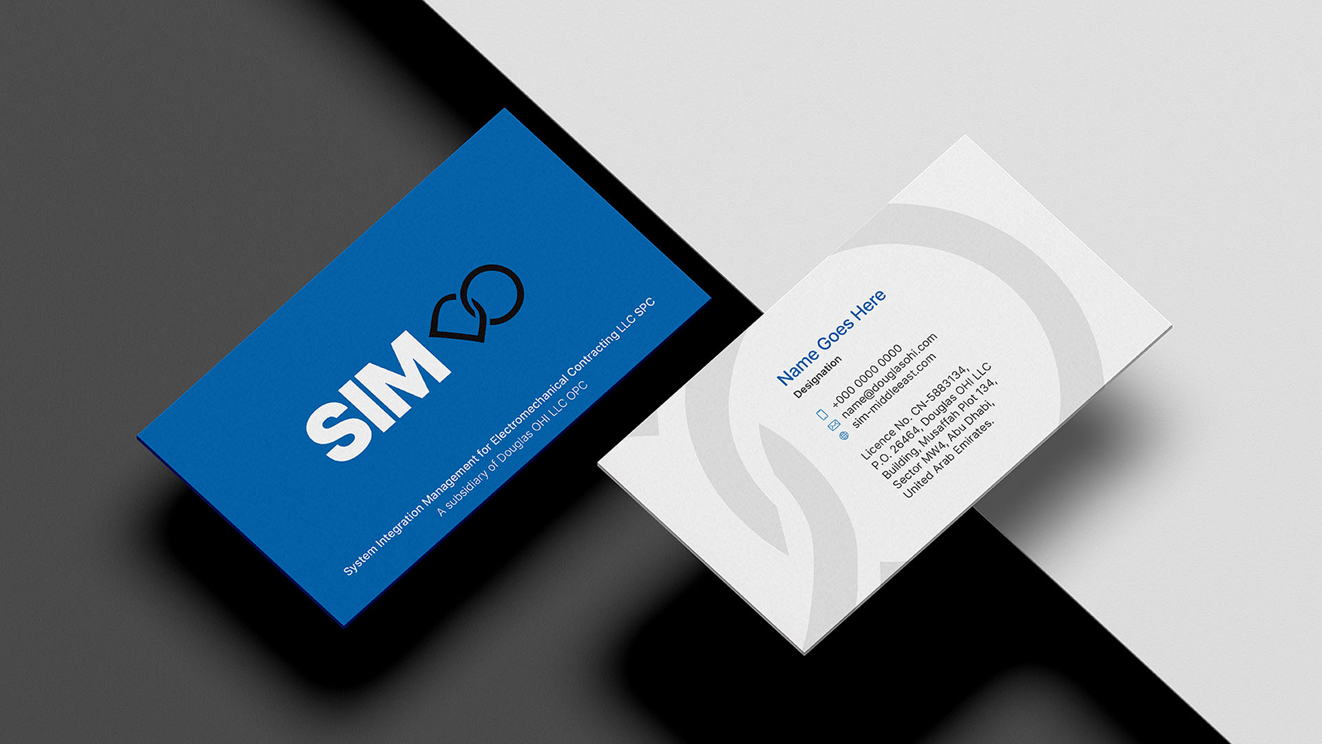
The SIM brand identity reflects strength, trust, and seamless integration. The bold, solid typography of SIM conveys reliability and technical expertise, while the interlinked DO symbol connects directly to Douglas OHI, reinforcing heritage and credibility. Its continuous loop represents integration, synergy, and forward momentum—mirroring SIM’s role in uniting systems, processes, and people. More than a mark, it is a visual expression of partnership and performance.


